
About two months ago, maybe three at this point, I was debating the architectural excellence of a building my coworker picked out while we drove to a job site in Ballard. Per the usual, I argued that I didn't find anything particularly good about the building while my coworker (who loves everything) praised the buildings supposed architectural excellence. As I mustered up the reasons the building wasn't good, I finally realized the leading cause of mediocrity plaguing much of Seattle's bad architecture- an unnecessary use of many material and color variations. Since this realization, I slowly documented mediocre buildings that demonstrate a non-committed facade. Through the documentation, it's apparent there are a variety of strategies, which I've started to decipher below. Before heading into the tour, here are some basics to look out for. The material choices come in composite woods (hardie), metal, vinyl, and the oh-so-hot real wood. The configurations of the materials come in vertical, horizontal, squares, and shingle. The colors lean towards multiple dominant colors, with a slightly dull or dated tint.
Disclaimer: some of these can be difficult to look at. Please open another tab in your browser of good architecture in case you find yourself feeling weak.
An Initial Assessment of Seattle's Non-committed Facades:
Horizontally - Perhaps this building is a new theoretical argument for top, middle, and base. The "rusticated" green base, a wide vertical middle, and a thin horizontal top. In case the materials were not making the argument clear, 3 dominant paint colors are used to emphasize the facade strategy.
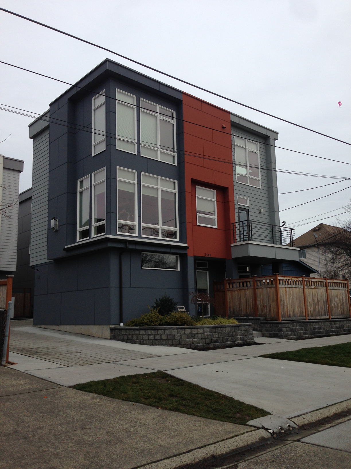
Vertically - We can see a similar strategy as mentioned above, except vertically. The material and color treatment suggests at one point the three different colored parts were separate massing elements. As the photo now demonstrates, the massing has been flattened, leaving the remnants of three different colors and two different material treatments (at least the colors aren't too terrible).

1/3, 2/3 - Outside the horrendous gluing of mass for what looks to be a wall vented fireplace, this building uses the 1/3 - 2/3 color strategy with white trim separating the vertical and shingle materials. Note how the adjacent property is the same configuration but the design uses a different color palette (so clever! I never suspected they were the same floor plans...).

Color 4 - The massing of this building indicates a love for saw blades as indicated with the roof line. Each additional massing strategy glued onto this building is further emphasized with a different color/material. The designer wanted to celebrate the saw blade idea by painting this a separate color (green) with a thin piece of trim (We wouldn't want to confuse it with the blue plane).
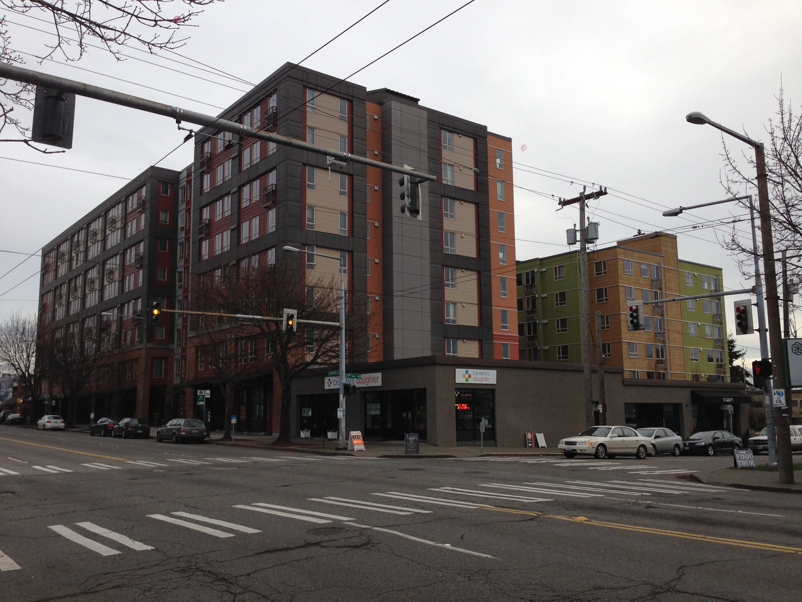
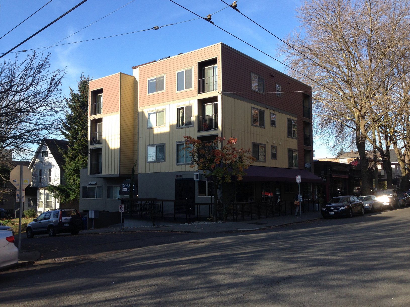
Color 5 - As massing grows, designers feel compelled to select more colors. The building on the left contains a more conservative massing strategy (not so much gluing to maximize profits) so the largely flat facade pops with 5 colors and 4 or 5 materials. Who needs a better massing strategy with a non-committed facade? (note the green and wood building on the right is still part of the same complex- color 7?).

Color 6ish - At some point it's hard to keep track of the colors, but this developer special building has a true uncommitted style to it's color palette.

Colors + Wood - What seems like a crappy developer copy of Silodam, the hot trend is to incorporate wood into the facade for a real pop. This building uses two colors of wood and inserts more wood randomly between windows on the left side. The randomness is topped off with the irrational play of blue on the wood side. It's like the designers can't figure out whats going wrong, so they impulsively add more materials and make the organization less rational.

Historically - While the lack of commitment is a more current occurrence, this house couldn't miss the opportunity to partake through the only power an older committed house can- paint. A separation of beige and brown is articulated horizontally on a board that meets the lower eave. No trim separation needed!
I could keep going, but I'll save you the torture. There are more in my ever growing album of Seattle's Non-committed Facades. The strategies are evolving and it would be interesting to follow up with this post in the future. The newest trend appears to be the random wood panel or color panel inserted into a monolithic portion as demonstrated with the color + wood project.
The non-committed facade is a poor design strategy that has dated these buildings, in addition to our city. I could see a good designer falling victim to this trend, but it's important to stray from complexity and use committed facade strategies. I would also like to encourage better massing, but this is a more difficult task.
---
On a closing note, either Gehry has fallen victim for Seattle's non-commitment or he studied up on his Seattle vernacular. I'll let you decide.
